
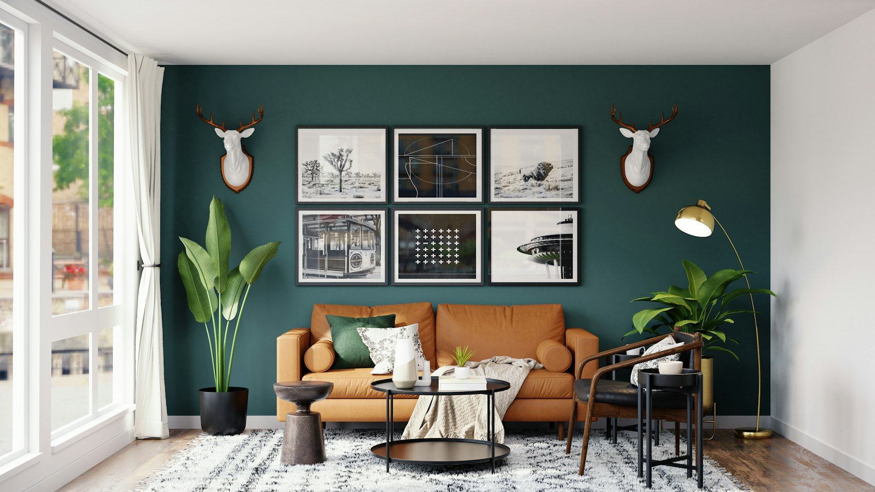
Every British paint chart is, at heart, a weather report. The soft grey that looks like a Tuscan morning under showroom spotlights can turn the colour of a wet pavement in a north-facing sitting room in February. Choosing paint here is less about fashion and more about light, and once you accept that, the whole business becomes a great deal less frightening.
This is our guide to the colours that genuinely work in real British homes: the heritage names everyone mentions in reverent tones, the hard-working neutrals, the brave darks, and the perfectly sensible ways to get a similar look when most of the budget has gone on the boiler.
Start with the light, not the swatch
Before you fall for anything, stand in the room at three different times of day and notice what the light is doing. North-facing rooms get cool, bluish, fairly even light all day. Colours with a grey or blue undertone sink into it and look chilly; warmer bases, anything with a drop of yellow, red or brown in the mix, hold their own. South-facing rooms are generous and forgiving and can carry cooler shades that would sulk elsewhere. East-facing rooms are bright and fresh in the morning and flat by teatime; west-facing rooms do the reverse, glowing gold in the evening.
Then think about what the room is actually for. A dining room used mostly after dark can be painted for lamplight, which flatters almost everything. A home office used from nine till five has to work in daylight, and on a grey Tuesday in November at that. The same colour can be right for one and wrong for the other, even in the same house.
In a north-facing room, stop trying to make it bright and start making it warm. It will never be a conservatory, but it can be wonderfully snug.
The heritage houses: Farrow & Ball and Little Greene
There is a reason these two names come up at every dinner party with a renovation in progress. Both make richly pigmented paints with a depth that seems to shift as the light moves round the room, and both have colour cards rooted in historic British interiors. Their colour names have become a kind of shorthand: say "Railings" to anyone who has redecorated in the last decade and they will picture that almost-black, faintly blue colour of a London front fence.
Finish matters as much as colour. Farrow & Ball's Estate Emulsion has a chalky, very flat look that is beautiful on old plaster but marks more easily, while their Modern Emulsion is the wipeable choice for hallways and family rooms. Little Greene offers a similar split between its soft Absolute Matt and the tougher Intelligent Matt. If you have children, dogs or a bicycle that lives in the hall, choose the tough one and do not feel you have compromised.
Neutrals that earn their keep
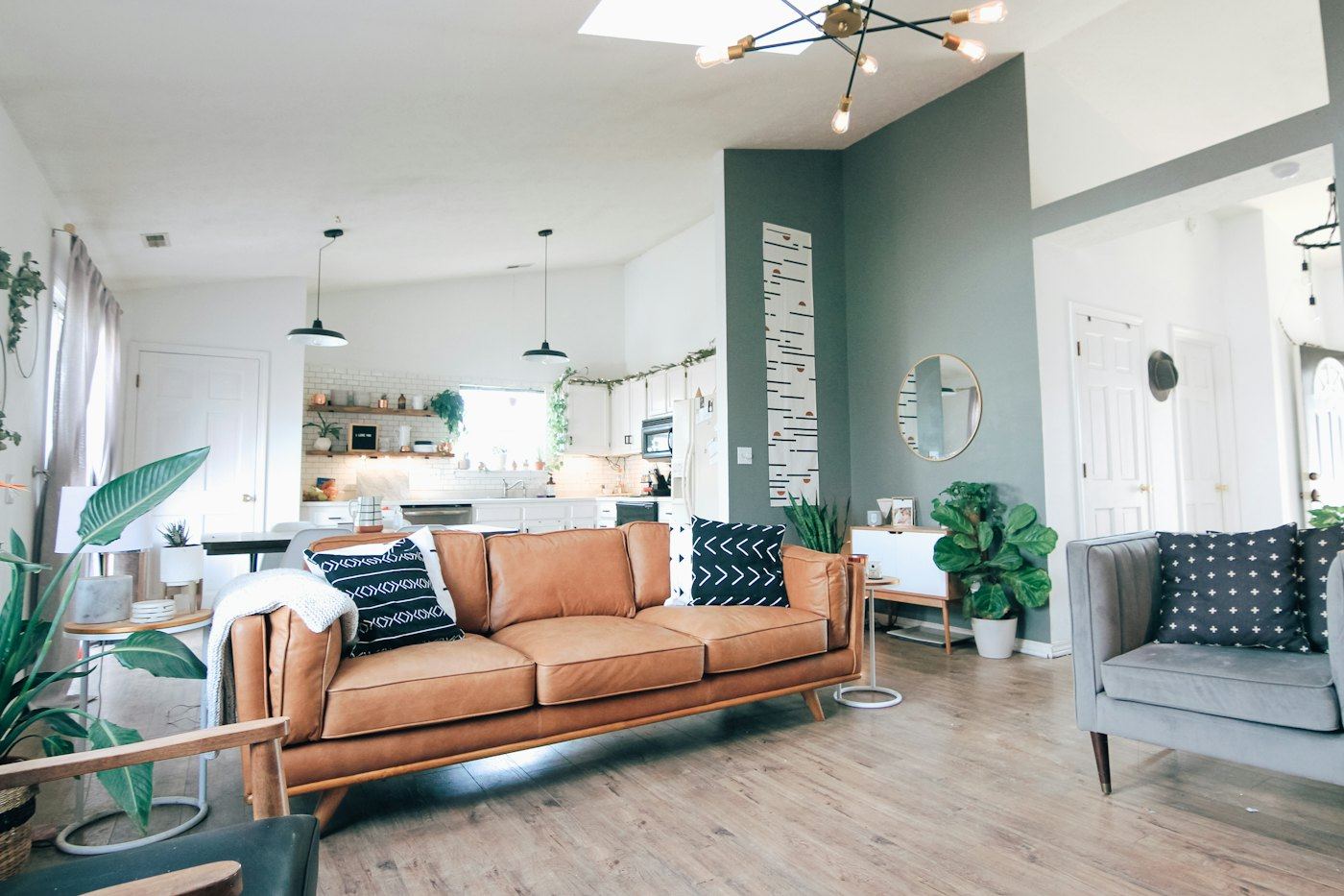
The great British neutral is rarely white and almost never a pure grey. The colours that last tend to be a little muddy, in the best sense. Farrow & Ball's Setting Plaster is a dusty pink that reads as warm skin rather than nursery, and it is a friend to north-facing rooms. Elephant's Breath is a warm, mushroomy grey with a hint of lilac that changes mood through the day. Pigeon sits somewhere between blue, grey and green, which makes it remarkably easy to live with, especially on kitchen cabinets.
For trim and ceilings, a warm white such as Pointing or Wimborne White softens the contrast that brilliant white creates against older, slightly uneven walls. Little Greene's French Grey is another quiet hero: a greenish grey that behaves beautifully alongside oak floors and old brick.
If you live in a period house, it is worth reading our piece on Victorian terraces before you paint over a picture rail; neutrals look especially good when the room's original bones are left to do the talking.
Going dark without the gloom
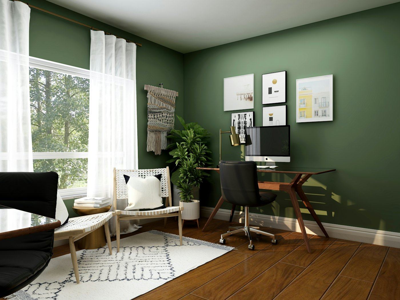
Dark colours are the best-kept secret of small, dim British rooms. Fighting a lack of light with pale paint often just produces a gloomy pale room; embracing it with something deep makes the space feel deliberate and enveloping. Hague Blue is the classic inky blue, Railings the near-black, Green Smoke a soft, smoky green-blue, and Little Greene's Obsidian Green a deep, slightly old-fashioned green that looks wonderful with brass and wood.
The trick is commitment. Painting the walls, skirting, picture rail and even the ceiling in the same colour, sometimes called colour drenching, blurs the edges of the room so it feels cosy rather than cramped. Add warm lamps at different heights and a few pale things (sheer curtains, a white-mounted print, a cream throw) so the eye has somewhere to rest. Our guide to the fireside corner shows how well a dark wall frames a chimney breast.
Budget alternatives and colour-matching
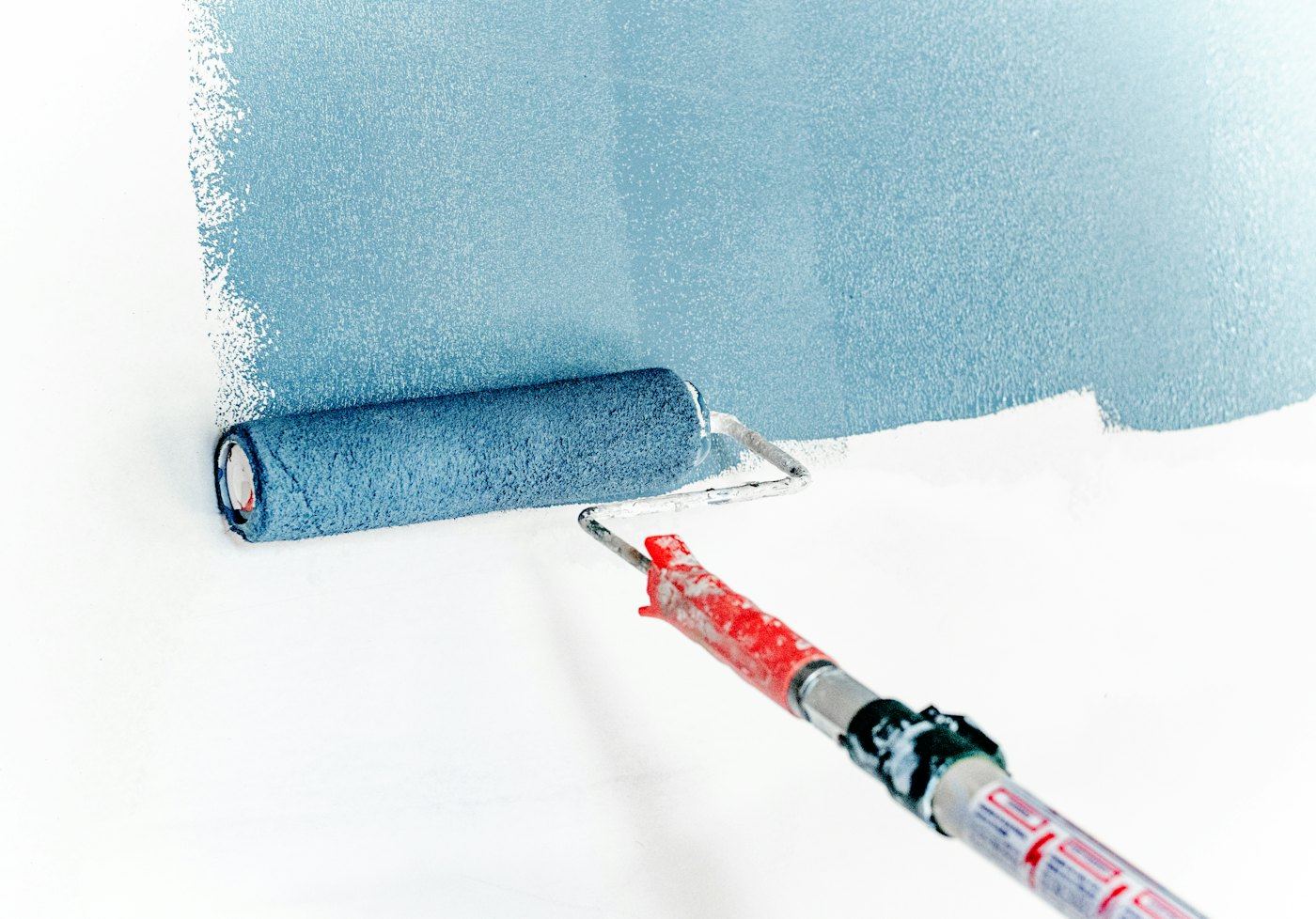
Not everyone wants to spend heritage money on a spare bedroom, and nobody should feel they have to. Many DIY stores and decorating merchants offer colour-matching, mixing a colour in brands such as Dulux, Crown or Valspar from a swatch or a colour reference. The results can be very pleasing, but go in with your eyes open: a matched colour is an approximation. Different pigments and bases mean the depth, sheen and the way the colour shifts in changing light can all differ from the original.
The mainstream brands also have their own historically minded ranges, Dulux's Heritage collection among them, which are worth a look before you reach for a match at all. And remember where money makes a visible difference: on large walls you look at every day, a richer paint can be worth it, while ceilings in a plain matt white from almost anywhere will look exactly like ceilings.
Test like you mean it
Tiny sample patches on the wall tell you very little, especially painted over the old colour. A little more effort here saves a weekend of repainting.
- Paint generous swatches, at least A4 size, on lining paper or card with a white border, so the old wall colour does not distort them.
- Apply two coats, as you would on the wall.
- Move the swatches around: next to the window, in the darkest corner, behind the sofa.
- Look at them in the morning, mid-afternoon and under your own lamps at night.
- Hold them against things that are not changing: the floor, the kitchen worktop, the curtains.
- Live with them for a few days before deciding. First love is unreliable.
Renting? Our deposit-friendly ideas include ways to bring in colour without touching a brush, and if your walls have a habit of turning spotty in winter, read our damp and condensation guide before choosing paint for the bathroom.
Our sitting room faces north and I painted it a very fashionable cool grey three years ago. It has looked like the inside of a filing cabinet ever since. Off to order some warmer samples, thank you for the push.
The filing cabinet effect is so common! Try a couple of samples with a red or yellow base, such as Setting Plaster or a warm stone, right next to your existing grey and the difference should be obvious straight away.
I had a heritage green colour-matched at a DIY store for our hallway and honestly most visitors can't tell. The finish came out a touch shinier though, so I agree it's worth asking about the base.
Would you paint the ceiling dark too in a small study, or does that make it feel like a cave? Ours is only about 2.4 metres high.
In a small study we would go for it. Colour drenching tends to blur the edges, so the room reads as cosy rather than low. If you are nervous, try a slightly lighter version of the wall colour on the ceiling first.
Slightly unpopular opinion: I think pale rooms are underrated in north-facing houses. We used a creamy white with plenty of lamps and it's lovely, not cold at all.