
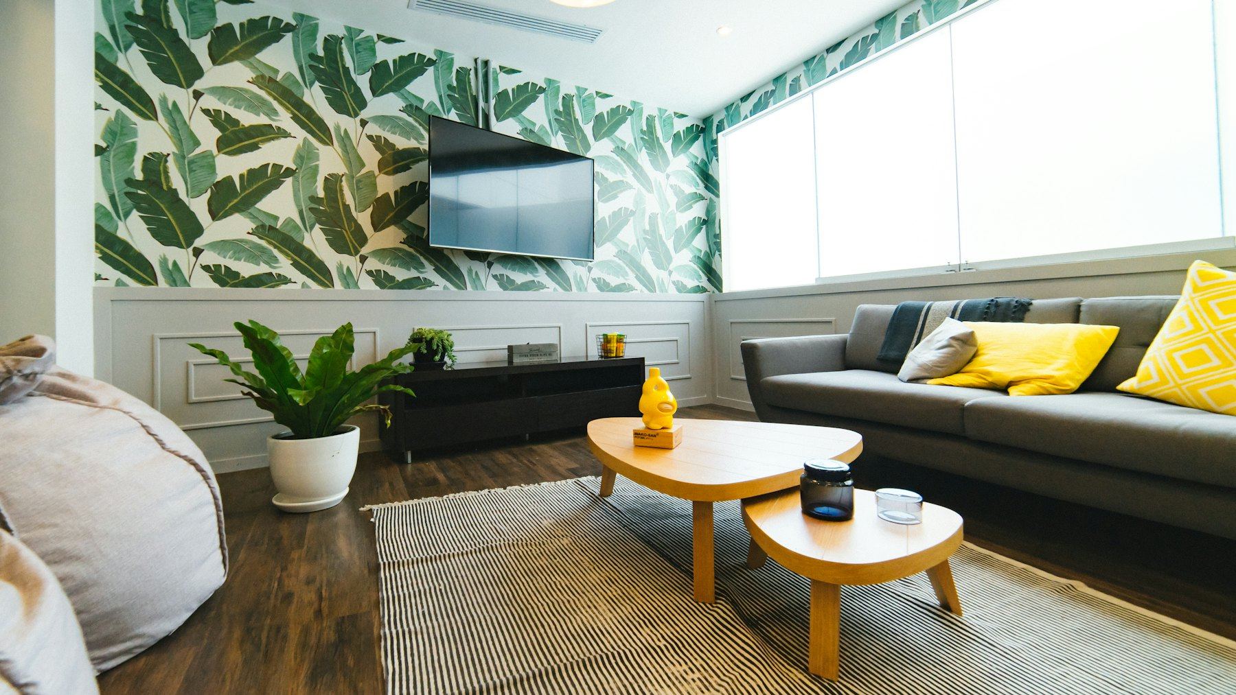
There is a particular sort of British house where you open a door and find a tiny downstairs loo papered floor to ceiling in strawberries and birds. Nobody planned it as a statement; it simply felt right. We have been papering our walls with flowers, leaves and vines for well over a century, and despite several decades of magnolia, the habit has never quite left us.
Pattern can make a room feel lived-in, layered and properly cosy. It can also, if you are not careful, make it feel like the inside of a chintz teapot. Here is how to land on the right side of that line.
Why we cannot resist a floral
Part of it is the garden. In a country obsessed with herbaceous borders and allotments, bringing the outside in is less a design trend than a national reflex. Part of it is the weather: when the view from the window is grey for months on end, a wall of leaves and blossom is a small act of defiance. And part of it is simply that pattern hides things. Uneven Victorian plaster, a slightly wonky chimney breast, the place where somebody once removed a gas fire: a busy floral forgives all of it in a way flat paint never will.
William Morris, then and now
No conversation about British wallpaper gets far without William Morris. His designs, drawn from the hedgerows, orchards and gardens he loved, are still printed today and still look extraordinarily fresh. Strawberry Thief, with its thrushes raiding the fruit beds, is probably the most famous; Willow Bough is gentler and easier to live with; and Trellis, one of his earliest wallpapers, was inspired by the rose trellises in the garden of his own home, Red House.
What makes Morris work in modern rooms is that his patterns are organised. The flowers and stems are lush but they follow a strong underlying structure, so the eye reads them as a calm whole rather than a scramble. That is a useful lesson whichever paper you choose.
Have nothing in your houses that you do not know to be useful, or believe to be beautiful.
William Morris
It is worth remembering that the most quoted line in British interiors is, at heart, an argument for restraint. Morris was not suggesting you cover every surface; he was asking you to be choosy.
Where pattern works hardest
Some rooms and surfaces are practically made for wallpaper. If you are new to pattern, these are the places to start.
- The downstairs loo. Small, short visits, nothing much else to look at. Be as bold as you like.
- Chimney breast alcoves. Papering just the alcoves, or the back of alcove shelving, gives a flash of pattern framed by plain walls.
- Above a dado or panelling. Painted panelling below and paper above is a very old British arrangement, and it halves the amount of pattern you have to commit to.
- Inside cupboards and on the backs of bookcases. A secret pleasure every time you open a door.
- Hallways. A patterned hall makes a superb first impression, but choose a scrubbable paper if bicycles and wet dogs pass through.
- Ceilings. In a bedroom with a low ceiling, a quiet pattern overhead can feel like lying under a canopy.
How not to overdo it
The most common mistake is not choosing a pattern that is too bold; it is choosing too many patterns that argue. A few simple rules keep the peace.
One star per eyeline
Stand in the doorway and look around. Ideally there should be one dominant pattern in each view. If the wallpaper is the star, keep the curtains plain or very small-scale, and let cushions pick up a single colour from the paper rather than introducing a new print.
Vary the scale
If you do want to layer patterns, as many lovely English country rooms do, make them different sizes: one large, one medium, one tiny. Two large-scale florals side by side compete; a big floral with a small check and a fine stripe looks collected over years.
Pull the colour through
Take the quietest colour in the paper, often a background green, stone or soft blue, and use it on the woodwork or the adjoining wall. It ties the pattern into the room so it looks intended rather than stuck on.
Give it some air
A heavily patterned room needs plain surfaces to rest the eye: a solid-coloured sofa, a bare stretch of floorboard, a simple lampshade. It is the plain things that make the pattern look good.
Pattern is like seasoning: the right amount makes everything taste more of itself. Too much and all you can taste is salt.
Prints: pattern without the paste
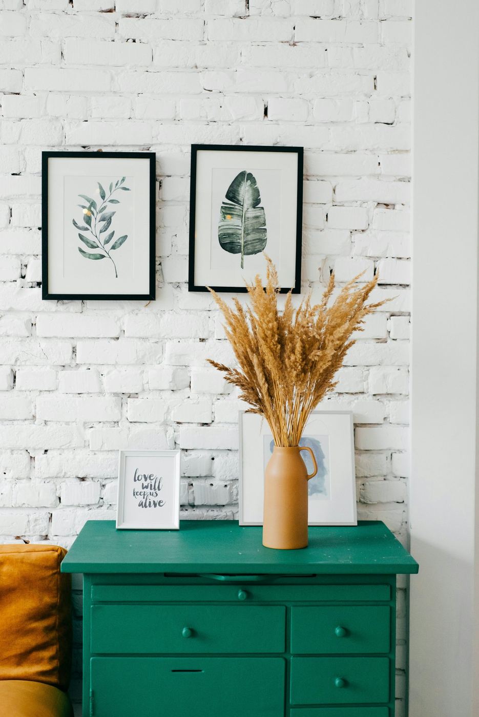
If wallpaper feels like too big a step, or you are renting and the landlord would rather you did not, framed botanical prints give much of the same effect. A row of pressed-leaf studies or old herbarium-style illustrations brings the garden indoors in a calmer, more gallery-like way. Hung against whitewashed brick or a soft plaster colour, they feel fresh rather than fussy.
Look for old book plates at antiques fairs and secondhand bookshops, frame them simply in oak or black, and hang them in a tight group so they read as one piece. Our gallery wall guide covers the spacing, and the charity shop and car boot guide is full of places to find frames that already have a bit of history.
Fabric is the other easy route. A floral curtain, a Morris-print cushion or a lampshade in a vintage remnant adds pattern you can take with you when you move.
Hanging it well
Good paper badly hung looks worse than no paper at all. A few practical points before you start: check every roll has the same batch number, because colours can vary slightly between print runs; order an extra roll for large pattern repeats, which waste more paper at every drop; and always start with the most visible wall, usually the one facing you as you walk in, so any compromise on pattern-matching ends up in a shadowy corner.
And if you are still not sure, buy a single roll and paper the inside of a wardrobe. If you open the door and smile every morning, you have your answer.
We put Strawberry Thief in our downstairs loo and it is now the most complimented room in the house, which is slightly embarrassing for the rest of it.
That is the downstairs loo effect in a nutshell! Small rooms really are the best place to be brave, and it might give you the confidence for the hall next.
Any advice for papering a chimney breast in a 1900s house where the plaster is quite lumpy? I'm worried every bump will show through.
Lining paper is your friend here: hang it horizontally first and the wallpaper will sit much more happily. A busy, multi-directional pattern also hides imperfections far better than a plain or geometric design.